|
 |
 |
 |
 |
 |
 |
 |
 |
 03-29-2008, 11:08 PM
|
#61 | |
|
Ride Like an Asshole

Join Date: Feb 2008
Moto: nothing...
Posts: 11,254
|
Quote:
|
|

|

|
|
03-29-2008, 11:21 PM
|
#62 |
|
TWFix Legend

Join Date: Feb 2008
Location: Denver CO
Moto: 01 BMW F650GS Dakar
Posts: 15,677
|
nope... triple rewards Visa
|
|
|
|
|
03-31-2008, 01:09 AM
|
#63 |
|
TWFix Legend
Join Date: Feb 2008
Location: Denver CO
Moto: 01 BMW F650GS Dakar
Posts: 15,677
|
Ok... here's what I got...
Pay no mind to the retarded model... Orange and Black  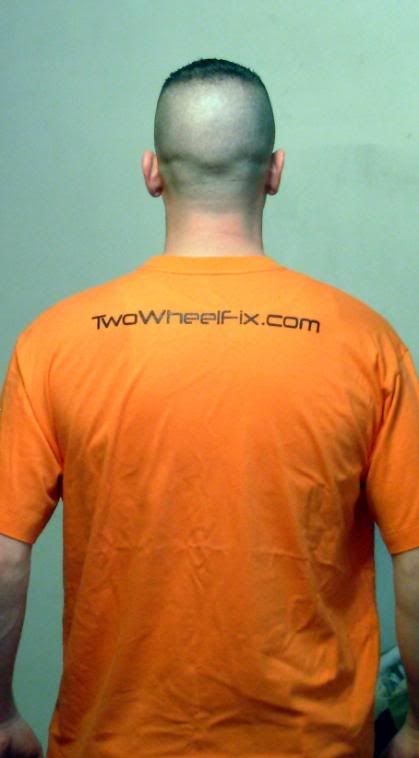 Black and Yellow  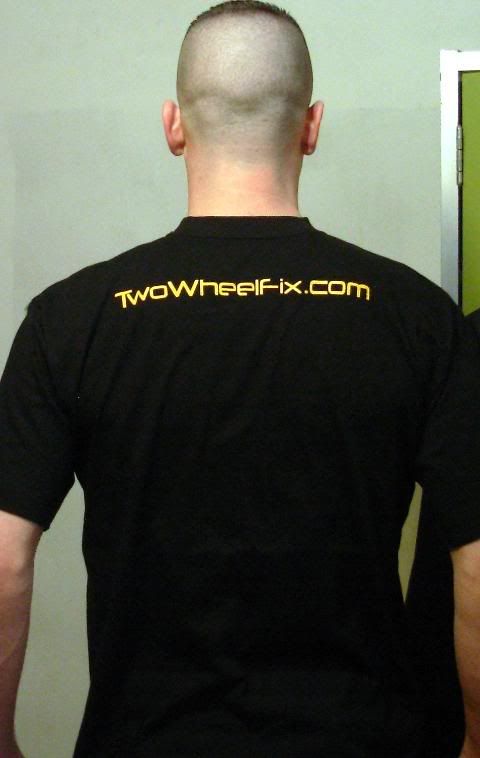 I think the back needs to be a bit larger and maybe a bit lower. the quality of the shirts feels really good... much better than the ones I got from Cafe Press... but that's IMO... Oh... and it will please DLit to know that both shirt both front and back are centered... I checked 
|
|
|
|
|
03-31-2008, 03:37 AM
|
#64 | |
|
Moto GP Star
Join Date: Mar 2008
Posts: 14,556
|
Quote:

|
|
|
|
|
|
03-31-2008, 03:41 AM
|
#65 |
|
Clit Commander

Join Date: Feb 2008
Location: Las Vegas
Moto: 2012 Ducati 1199 Panigale S
Posts: 4,189
|
I think the front logo should be on the back and the back logo on the front. Seriously...it'll be WAY better that way.
__________________
Dress for the crash. Not the ride. 
|
|
|
|
|
03-31-2008, 03:45 AM
|
#66 | |
|
TWFix Legend
Join Date: Feb 2008
Location: Denver CO
Moto: 01 BMW F650GS Dakar
Posts: 15,677
|
Quote:
this ain't riding gear...
|
|
|
|
|
|
03-31-2008, 03:45 AM
|
#67 | |
|
Moto GP Star
Join Date: Mar 2008
Posts: 14,556
|
Quote:
I know this is "cheesy" but can't we get a bike on there somewhere? Maybe a one doing a wheelie across the letters on the back? |
|
|
|
|
|
03-31-2008, 03:46 AM
|
#68 | ||
|
TWFix Legend
Join Date: Feb 2008
Location: Denver CO
Moto: 01 BMW F650GS Dakar
Posts: 15,677
|
Quote:
another nice thing... these shirts don't have tags... so nothing to itch or cut out... Quote:
naw... I think that might look ok... or OSP's guy drag'n a knee?  I'm pretty happy with the front... I'm gonna have another made with "Don't Ride Like An Asshole" on the back |
||
|
|
|
|
03-31-2008, 03:55 AM
|
#69 |
|
Clit Commander
Join Date: Feb 2008
Location: Las Vegas
Moto: 2012 Ducati 1199 Panigale S
Posts: 4,189
|
Reverse the logos and you'll be good. But, either way, they're not too bad at all. I like the black/yellow.
__________________
Dress for the crash. Not the ride.
|
|
|
|
|
03-31-2008, 04:02 AM
|
#70 | |
|
TWFix Legend
Join Date: Feb 2008
Location: Denver CO
Moto: 01 BMW F650GS Dakar
Posts: 15,677
|
Quote:
I think if we do any on light colors they need to be "bold" or increase the thickness of everything... IMO |
|
|
|
|
 |
| Bookmarks |
|
|


 I'm gonna take what ever we decide on and get it put on a bright ass orange t-shirt here... maybe a couple red ones and a few Blue...


 Linear Mode

